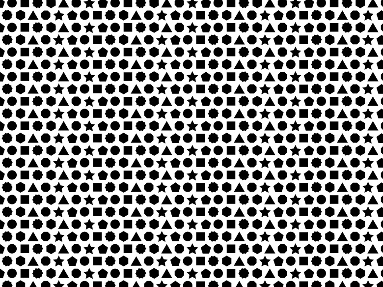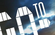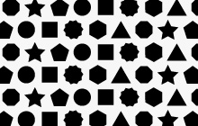
Factuality, simplicity and precision are the main three qualities of a good news media. All these characteristics can be easily voiced with the help of the elementary and informative graphic symbol –dot, especially imparting particular visual properties to it.
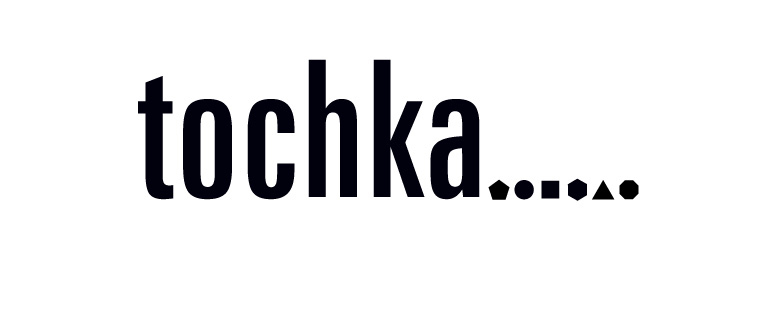
In the logotype we used dots of various shapes reflecting the multiplicity of news and events described on the portal. Clear, laconic type together with the range of multi-shaped dot-symbols create intensional and simple yet contemprorary and trendy image.
In the logotype we used dots of various shapes reflecting the multiplicity of news and events described on the portal. Clear, laconic type together with the range of multi-shaped dot-symbols create intensional and simple yet contemprorary and trendy image.